A re-fresh that uplifted the brand to a new level of success.
LADY LOLAS – VISUAL IDENTITY DESIGN

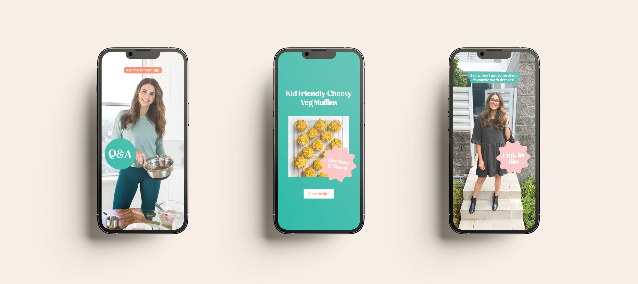
Katie, the lady behind the ‘Lady Lolas’ lifestyle blog is a confident, genuine and authentic media personality.
When Katie came to us to improve her branding, it was time for a re-fresh. Her old logo served her well but Katie felt it lacked a certain maturity and wasn’t representing where her business was heading.
With connection and community at the forefront of the Lady Lolas brand purpose, the new visual identity needed to align with a confident and approachable brand personality
“YAAY! I’M SO HAPPY AND EXCITED! XX”
- Katie, Lady Lolas
We presented 3 concepts...

A FRIENDLY COMMUNITY VIBE WITH A RELAXED FEEL.


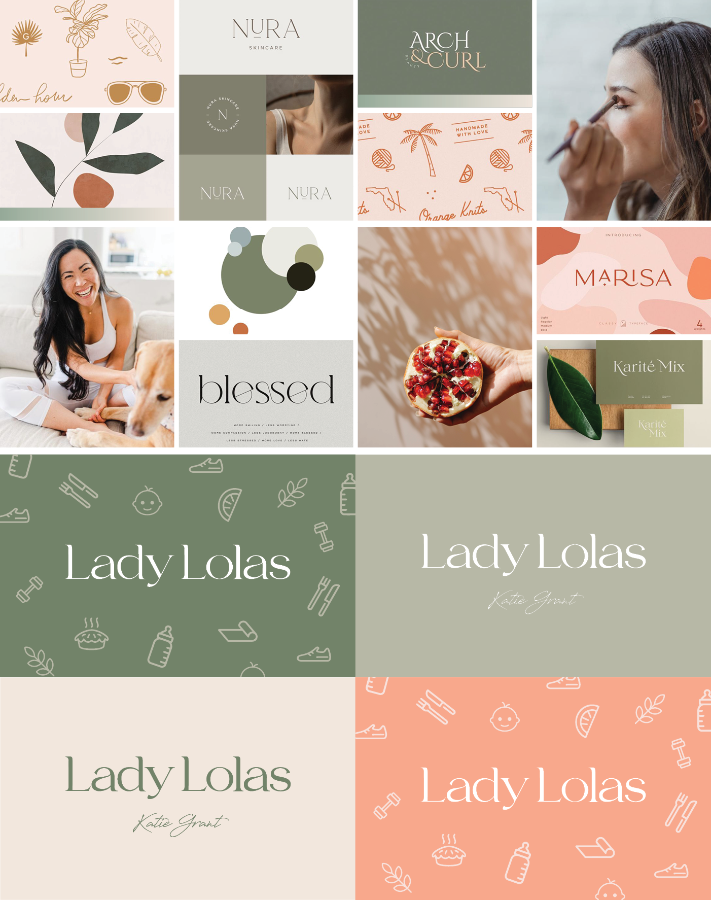
HIGH-END, SOPHISTICATED AND TIMELESS
FUN, AUTHENTIC AND DOWN TO EARTH

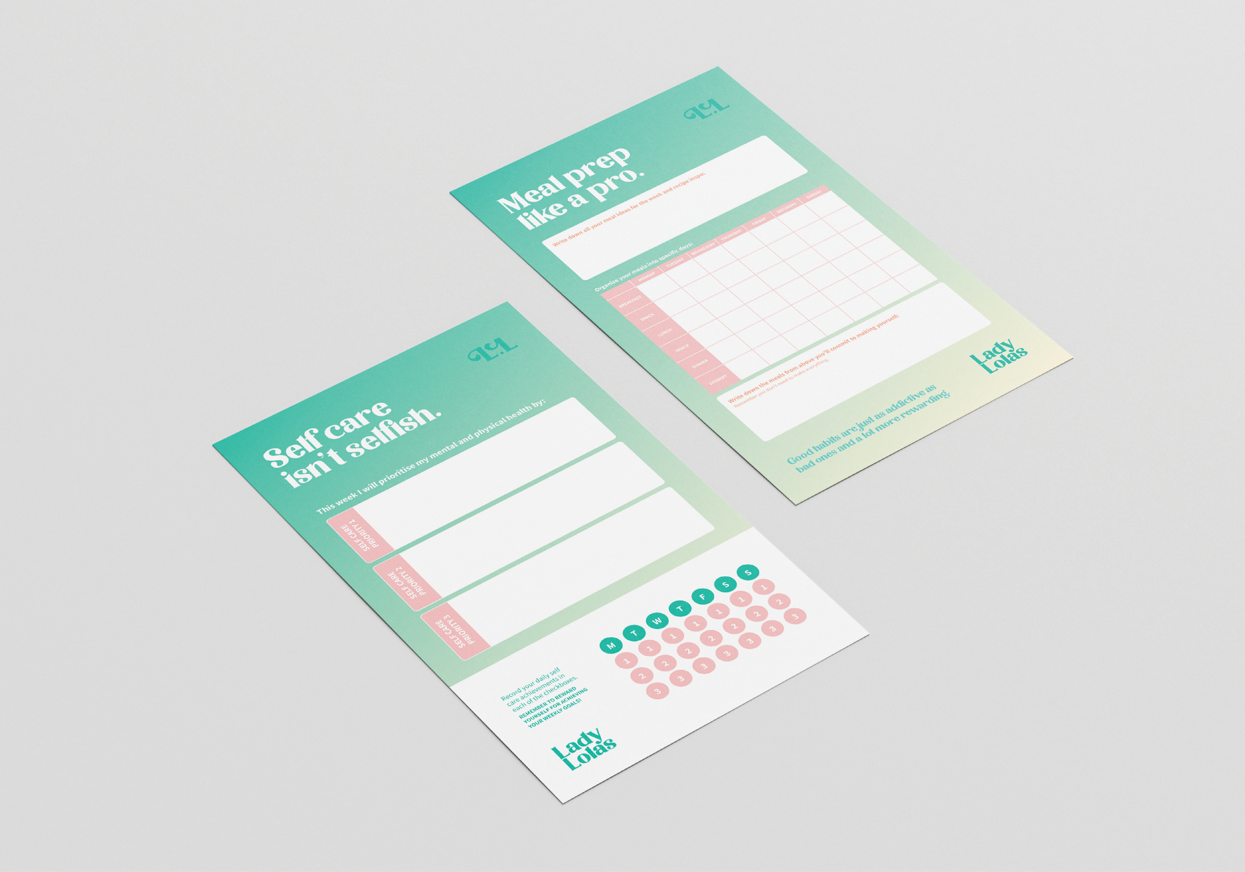
The final concept
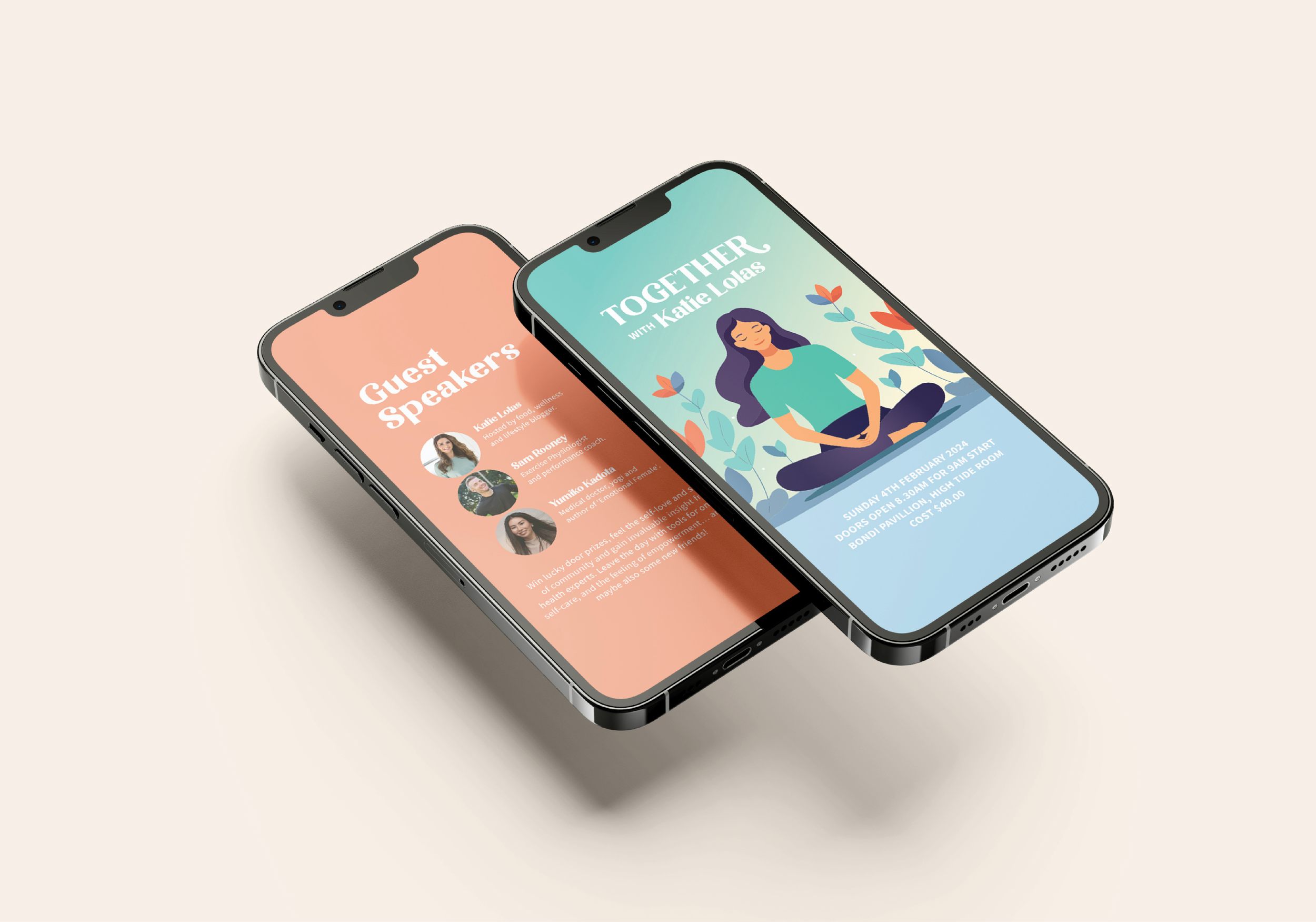
Katie chose concept number 3 and we developed it further together to land on a visual identity that she absolutely loved. The new brand communicates Lady Lolas as an approachable, uplifting and supportive company that inspires other women to have fun.


“THAT’S IT. I LOVE. IT’S FUN AND VIBRANT, YET HAS A MORE MATURE FEEL TO IT IN COMPARISON TO MY CURRENT BRAND.”
– Katie, Lady Lolas